
Teaching Design to Non-Designers: A Plaque Studio
I built a small interactive web app to teach one design principle to people who've never designed anything before, built for a workshop I designed over the summer. It's for community members, small nonprofits, anyone who's been handed the job of getting a memorial or dedication plaque made and has no idea where to start. This one's part of the vibe-coded series, and it's less about a technical problem and more about a teaching problem I had to solve before I could write a single line of code.
What's the one idea worth teaching?
Plaque design touches material, casting, mounting, typography, spacing, copywriting, which is way too much ground for a room of beginners in one sitting. So before building anything, I had to decide what the workshop was actually about. If I could only get one principle to stick, it had to be this: a plaque only has a fixed amount of attention to give, and good design decides where that attention goes instead of trying to spread it everywhere. Designers call this hierarchy. The felt version is more useful for a beginner though, when every line on a plaque shouts, nothing gets heard. When one line leads and the rest step back, the plaque reads instantly.
Why one tool instead of three?
My first instinct was to build three separate mini-tools, one for layout, one for hierarchy, one for type pairing. But three tools is three things to explain, and a workshop lives or dies on how fast people get to the good part. So I collapsed all three into a single screen, one fixed bronze plaque that everyone designs into, with all three decisions stacked as controls beside it. That consolidation ended up being the most important decision in the whole project, and it wasn't a technical one. It was a teaching one.
How does the hierarchy slider actually work?
This was the piece I most wanted to get right, because a naive slider teaches the wrong lesson. If the slider just made everything bigger, it would reinforce the exact beginner instinct I was trying to fix, emphasizing everything at once. So instead the slider spends a fixed budget of attention. You pick which single line should lead, the name, the dates, the dedication, and then as you push the slider, that line grows in size and weight while every other line shrinks and dims to make room. You genuinely can't lift one thing without lowering the rest. That's hierarchy made physical instead of explained in a lecture.
The plaque also talks back while you work. Push the contrast down to near zero and it warns you that everything's carrying equal weight, so nothing reads first. Push it to the extreme and it reminds you to double check that the line you emphasized is actually the one that matters. It's coaching in real time, the way I'd circulate a room during a workshop, except for everyone at once.
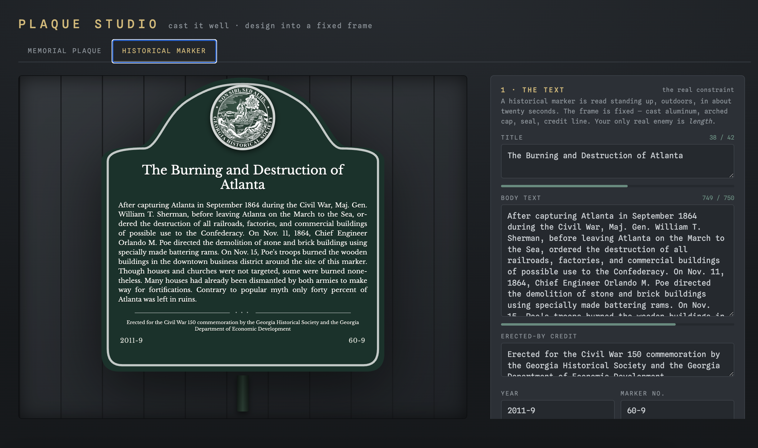
What does the interface itself look like?
The whole thing borrows from a foundry and civic aesthetic instead of generic software chrome, patinated bronze and verdigris on a dark slate wall, so the plaque reads as mounted rather than floating in a form. It's got beveled edges, recessed lettering, and four bolts to feel cast instead of printed. The controls sit in a quiet monospace so the ceremonial serif on the plaque itself stays the actual star of the screen. The goal was for the tool to feel like the thing it's teaching, restraint demonstrated instead of just described.
FAQ
Who is this tool actually built for? Non-designers, specifically community members and small nonprofits who've been tasked with getting a memorial or dedication plaque made and don't have a design background.
What's the one concept it teaches? Visual hierarchy, the idea that a design only has a fixed amount of attention to give, and good design decides where that attention goes rather than spreading it evenly.