
Living Infographics

Living Infographics are a fun, immersive way to collect data and engage with the people around you.
“Atlanta designer Sarah Lawrence has developed an interactive project that allows residents to take a look at how their daily commutes compare to those of others across the city, while thinking about why they use their particular mode.”
Featured Project:
The Atlanta Region’s Plan
Atlanta is scheduled to grow by about 2.9 million people by the year 2050 – imagine this as the entire city of Denver, Colorado just picking up and moving south. The Atlanta Regional Commission’s job is to plan, in the long and the short term, for regional growth across a 10-county metro area, and they’re thinking hard about this 2.9 million-person influx. What does that mean for commuting? What does that mean for healthcare? What does it mean when, by 2050, 1 in 8 adults in Atlanta will be over 75?
Every four years they revise their 20-year plan based on current models, technology, and the state of life in the city and release a newer, more updated strategy – they call it the Atlanta Regions Plan. This makes so much sense, since a plan even based in 2012 would be out of date now. Self-driving cars are on the horizon, rapid transit models are shifting, and new studies come out every day proving that cities must be walkable for people to thrive.
To gather information from the people who live in the ARC’s 20-county metro region, they hosted a series of open houses in October 2019 to talk to and learn from the people on the ground in this changing ecosystem. In additional to infographic-style boards meant to explain what a rapidly-changing region means and might need, we worked together to create three different interactivities to learn more.

Chord Diagram
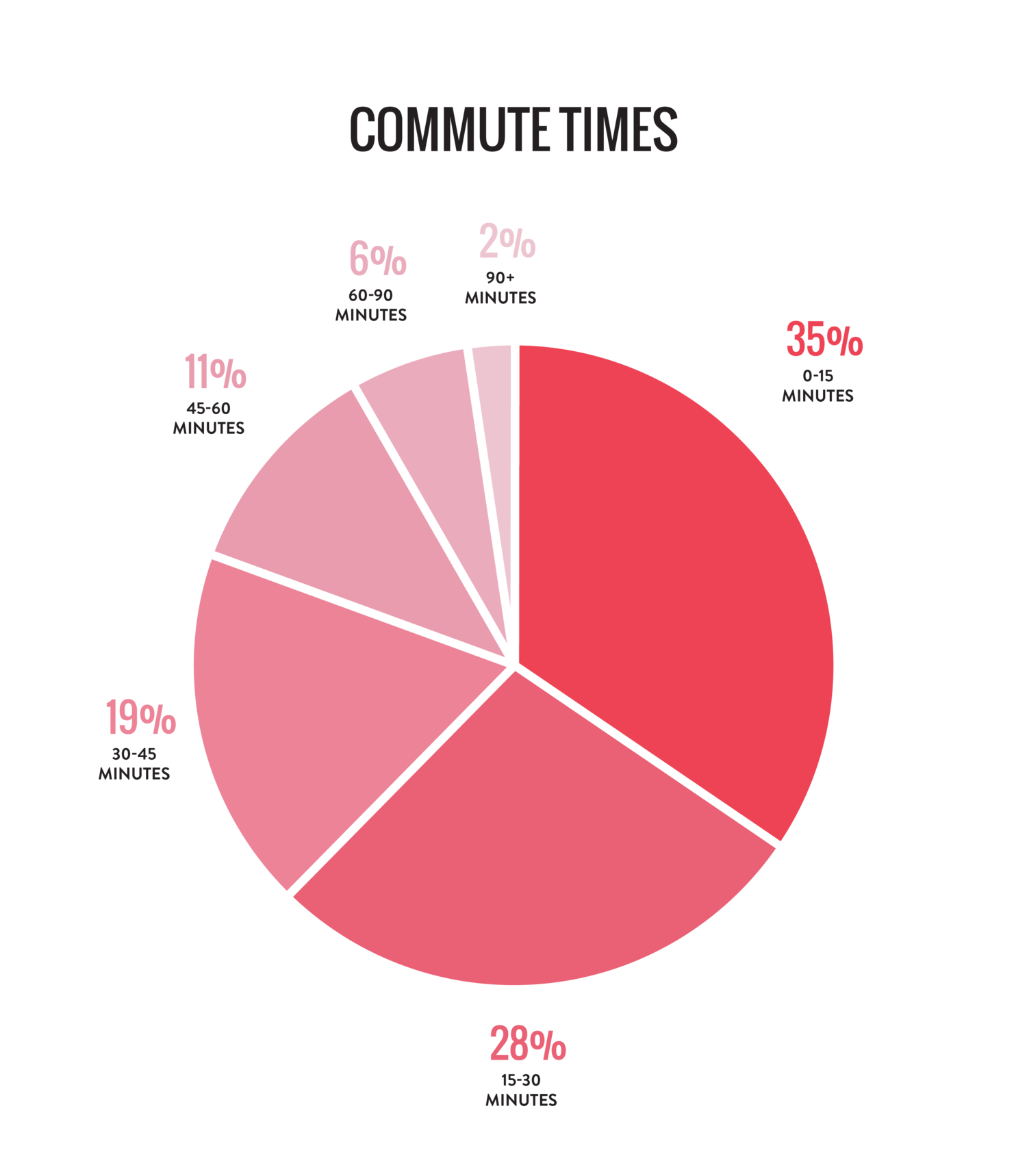
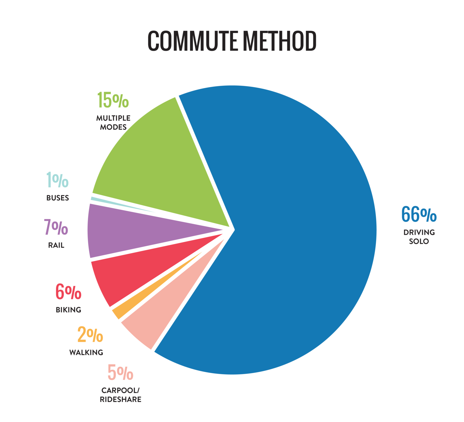
You can interact with the Living Infographics project in any order, but for the sake of these results, let’s start with the commuting chord diagram. Overwhelmingly, 64% of the folks who participated in this activity drive a car by themselves to work or school. Many were surprised to see this data taking shape, which is interesting – a lot of people assume that others take alternate forms of transportation.


Parallel Coordinates
Even before the event was over, we noticed a pattern: most of the respondents reported that they drove solo, but about 50% of them preferred to continue doing so. After that, the next largest group wished they could commute by rail. In general, one of the interesting things about this graph is that a lot of people already prefer the type of commute they have. People who like to drive do so, people who like to take the train do so. This in turn informed their goals for the region’s budget: folks who ride their bike to work and want to keep doing so.
Additionally, suburban respondents had higher rates of driving, which makes sense when you consider that outside of the city, activities are pretty spread out. Very few City of Atlanta respondents mentioned that they commute via vehicle; almost half of the respondents ride a bike to work, followed by walking, rail and multiple modes (which can mean driving a car to a MARTA station).
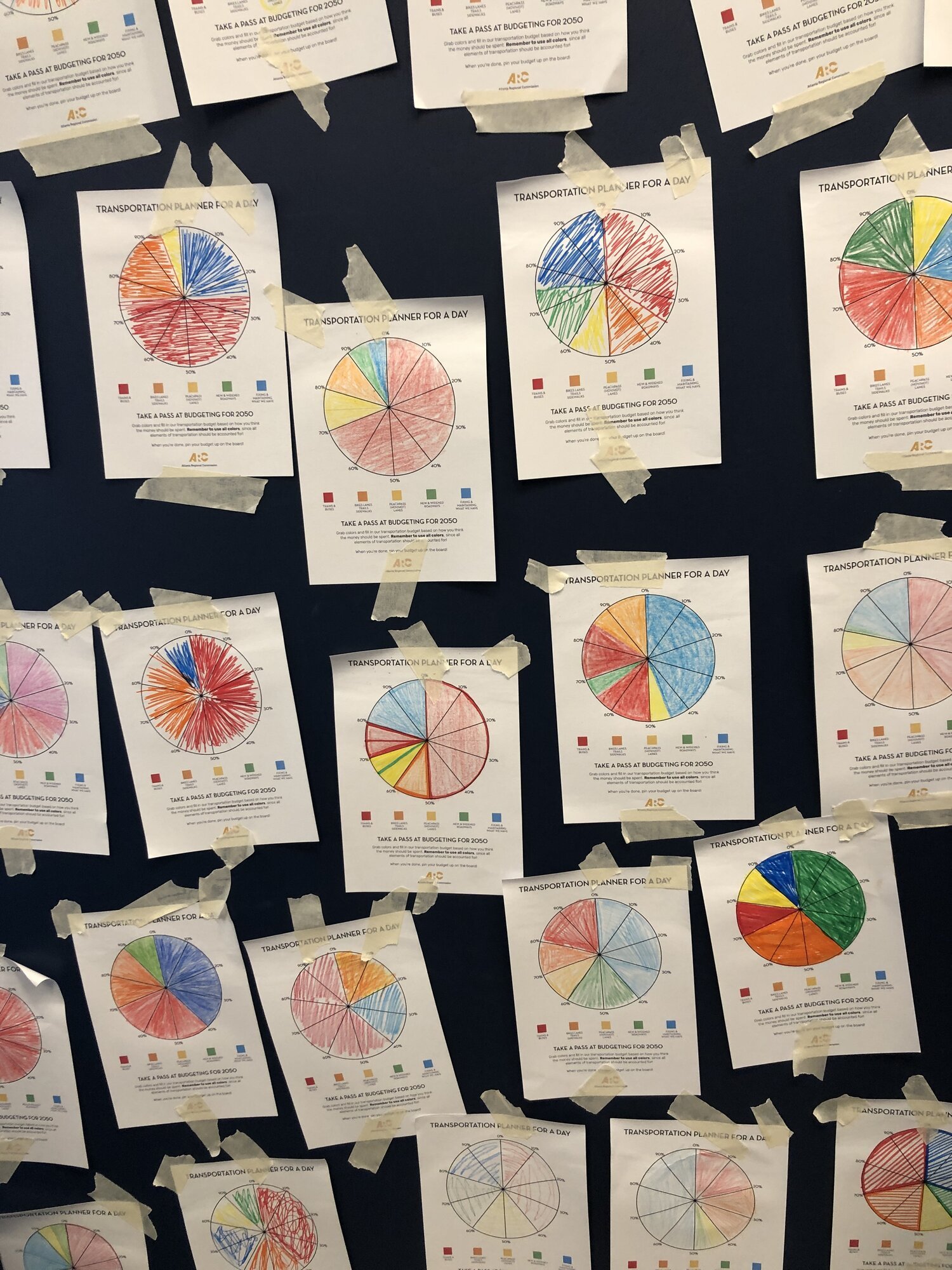
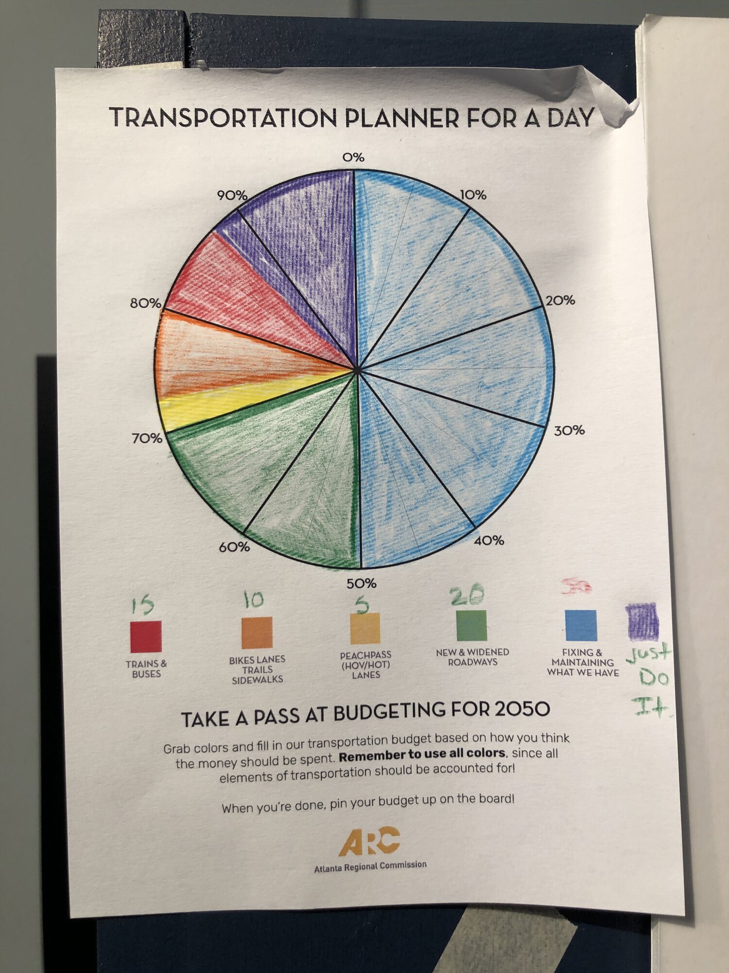
Pie Chart Activity
We came up with an idea during this project to have people create their own budgets for Atlanta’s transportation once they’d learned about how the region makes and spends money on transportation. This activity was meant to be a little tough, because you must use all five colors. A bike enthusiast can’t color their entire pie chart in orange, they must consider the needs of non-cyclists.

The Results
We averaged out the responses for all five categories to show how people would prefer to spend Atlanta’s transportation funds. Trains and buses easily came out on top, followed by fixing and maintaining what we have (it currently costs 66% of the region’s transportation budget to perform maintenance on existing transportation systems.)
More photos from the event:
Photos by Ryan Barrett


